Simon Tye, PhD student
Siepielski Lab, University of Arkansas
Introduction
Many graduate students use the open-source programming language R to compile, examine, and visualize data. For visualizations, online resources (e.g., R Cookbook) and major R packages (e.g., ggplot2, lattice, leaflet, plotly) are often the first steps taken. While these packages allow users to create a wide variety of captivating figures, it may be cumbersome to write code that performs the required task within a specific package’s framework.
To help graduate students enhance their figures and dissemination abilities, I am going to briefly show you how to edit a figure that was created in R via Adobe Illustrator. For this tutorial, I will be using a built-in dataset in R, iris, and the Essential Classics Workspace in Adobe Illustrator CC 2020. This dataset has information on sepals and petals for 3 species of Iris (I. setosa, I. versicolor, and I. virginica). Below is an overview of these data.
head(iris)
##   Sepal.Length Sepal.Width Petal.Length Petal.Width Species
## 1          5.1         3.5          1.4         0.2  setosa
## 2          4.9         3.0          1.4         0.2  setosa
## 3          4.7         3.2          1.3         0.2  setosa
## 4          4.6         3.1          1.5         0.2  setosa
## 5          5.0         3.6          1.4         0.2  setosa
## 6          5.4         3.9          1.7         0.4  setosa
R: Summarizing your data
First, we need to calculate the means, standard deviations, and standard errors of these data using the dplyr package, as shown below. For brevity, the data are abbreviated as follows: Sepal.Length = SL, Sepal.Width = SW, Petal.Length = PL, Petal.Width = PW.
library("dplyr")

iris.sum <- iris %>%
  group_by(Species) %>%
  summarize(
    # Sepal.Length
    SL.length    = length(Sepal.Length),
    SL.mean      = mean(Sepal.Length),
    SL.sd        = sd(Sepal.Length),
    SL.se        = SL.sd / sqrt(SL.length),
    # Sepal.Width
    SW.length    = length(Sepal.Width),
    SW.mean      = mean(Sepal.Width),
    SW.sd        = sd(Sepal.Width),
    SW.se        = SW.sd / sqrt(SW.length),
    # Petal.Length
    PL.length    = length(Petal.Length),
    PL.mean      = mean(Petal.Length),
    PL.sd        = sd(Petal.Length),
    PL.se        = PL.sd / sqrt(PL.length),
    # Petal.Width
    PW.length    = length(Petal.Width),
    PW.mean      = mean(Petal.Width),
    PW.sd        = sd(Petal.Width),
    PW.se        = PW.sd / sqrt(PW.length))
R: Creating a figure with the ggplot2 package
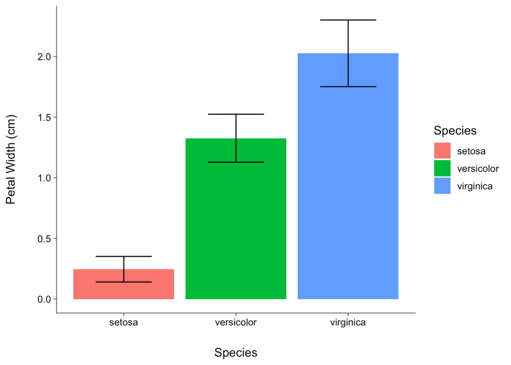
Next, we will create a barplot f the petal lengths for each Iris species using the ggplot2 package. The first few lines are code below are basic ggplot2 functions that load the dataset, describe the barplot, and add error bars based on our previous calculations. For this figure, I used standard deviations for the error bars because the standard error values were low and inconsequential. The following lines (e.g., theme_bw…) define different elements of the plot and are not wholly necessary, but I find them useful. For example, the axes and tick marks in ggplot2 are a dark gray color by default, and this code changes the color of these elements to black. It also increases the margin space between the tick labels and axis label.
library("ggplot2")

ggplot(data = iris.sum, aes(x = Species)) +
  geom_bar(aes(y = PW.mean, fill = Species), position = "dodge", stat = "identity") +
  geom_errorbar(aes(ymin = PW.mean - PW.sd, ymax = PW.mean + PW.sd), width = 0.5, position = position_dodge(width = 0.5), color = "black") +
  theme_bw(base_size = 12) +
  theme(panel.grid.major = element_blank(),
        panel.grid.minor = element_blank(),
        panel.border = element_blank(),
        axis.line = element_line(color = "black", size = .25, lineend = "square"),
        axis.ticks = element_line(color = "black", size = .25),
        axis.title = element_text(color = "black"),
        axis.text.y = element_text(color = "black"),
        axis.text.x = element_text(color = "black"),
        axis.title.x = element_text(margin = margin(t = 20, r = 0, b = 0, l = 0)),
        axis.title.y.left = element_text(margin = margin(t = 0, r = 20, b = 0, l = 0)),
        axis.title.y.right = element_text(margin = margin(t = 0, r = 0, b = 0, l = 20))) +
  labs(x = "Species", y = "Petal Width (cm)")
R: Transferring a ggplot2 figure to Adobe Illustrator
The resulting figure would certainly suffice for a quick presentation, but it is not very captivating or visually stimulating. To remedy this, we are going to add some elements in Adobe Illustrator CC, which is often available through academic institutions for a discounted price. For example, the entire Adobe Creative Cloud suite is available through the University of Arkansas for ~$10/year. Luckily, it is a simple process to export figures from R and import them into Illustrator; you just need to export it as a PDF.
Many R users utilize the RStudio interface, which makes the export process rather straightforward. Once you run the code that creates a particular figure (i.e., the code listed above), the resulting figure should display in the lower right corner of your RStudio interface. Above the displayed figure, click Export and Save as PDF. In the pop-up display, you can change the size and export location of the figure. The initial figure size is determined by the Device Size, which is simply the size of the window within RStudio that is currently displaying your figure. After changing the size parameters and save location to suit your needs, click Save.
Adobe Illustrator: Adjusting the artboard
Next, locate this file on your hard drive, right-click it, and open it in Illustrator. Depending on your Illustrator settings, the loaded figure may or may not be placed on a similarly-sized artboard (i.e., the canvas). Typically, only the graphics that are on an artboard will be exported, though you can easily change this setting when saving a file. If you need to adjust the size of your artboard, select the Artboard Tool (red circle, Fig. 1) or press the keyboard shortcut Shift + Q. Then click and drag the corners of your artboard to the edge of your figure.
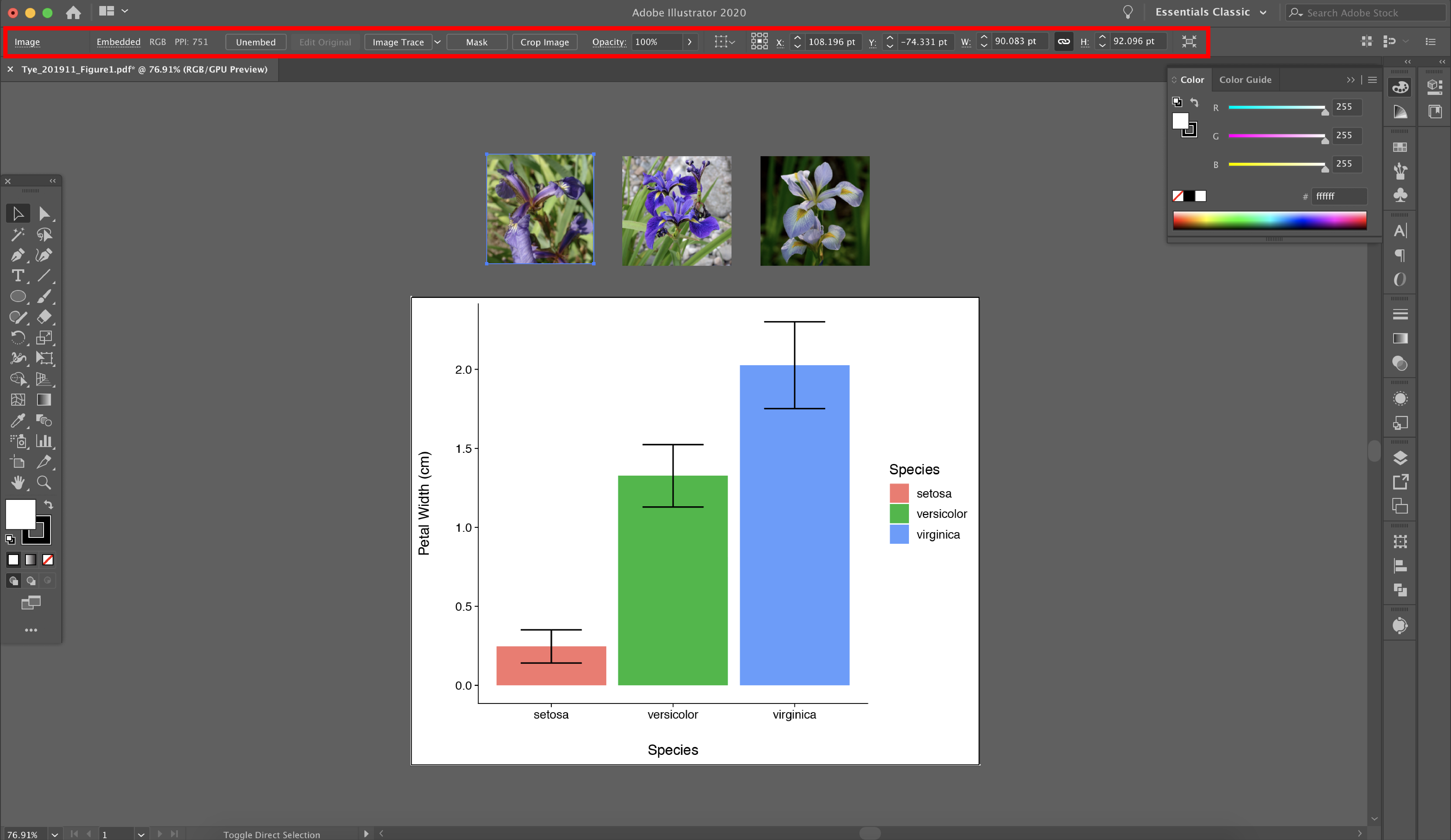
Figure 1. How to adjust an artboard (i.e., canvas) in Adobe Illustrator CC 2020.
Adobe Illustrator: Removing bounding boxes
The second step is to remove figure elements that impede certain edits you may wish to perform. Specifically, ggplot2 figures have various bounding boxes that, while not noticeable at first, will get in the way when you want to select elements later on. The easiest way to accomplish this is to select the Direct Selection Tool (red circle, Fig. 2) or press the keyboard shortcut A. Then click and drag over one corner of the figure (red square, Fig. 2), and press Delete twice. It is very important that you press Delete twice, as pressing it once will delete these specific points (i.e., in the corner), and pressing it twice will delete all remaining points in the objects.
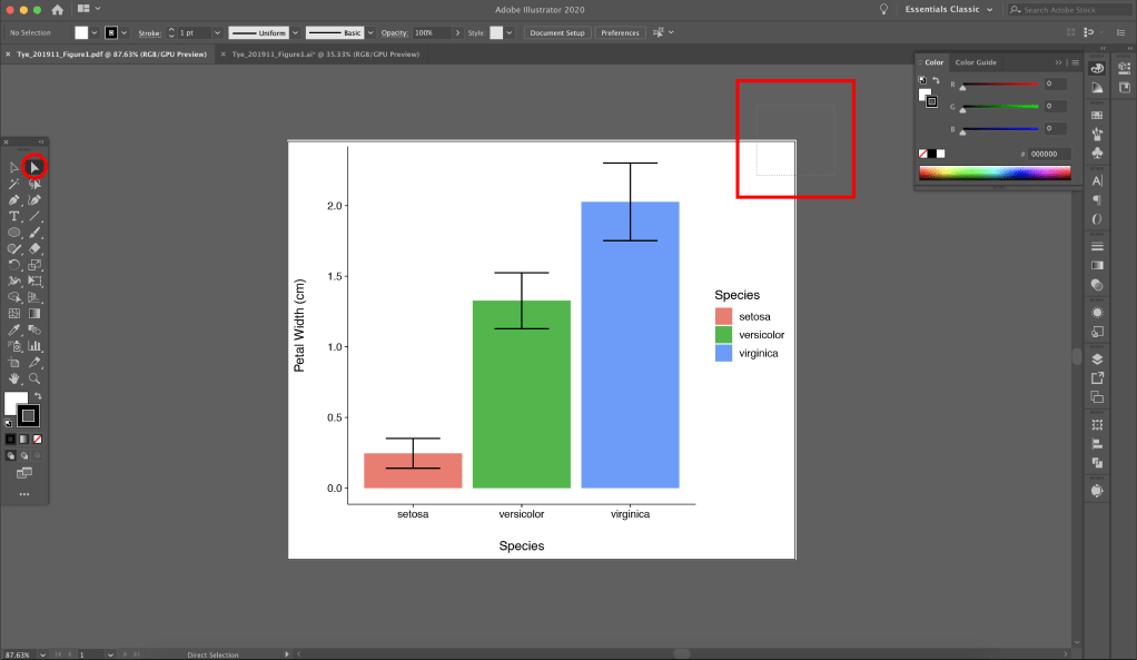
Figure 2. How to remove bounding boxes of a ggplot2 figure. Be sure not to select any important elements of your figure, such as the barplot or legend.
Adobe Illustrator: Ungrouping the plotting area
The third step is to make ungroup objects within the plotting area (red rectangle, Fig. 3) so that they may be edited separately. When a PDF is exported from R, the objects within the plotting area are in a Clip Group. To remove them from this group, select the plotting area (red rectangle, Fig. 3) and click Edit Clipping Path on the left end of the top toolbar (red circle, Fig. 3). Next, reselect the plotting area and go to the top menu and click Object / Ungroup. Now all the objects within your plotting area have been ungrouped and may be edited separately.
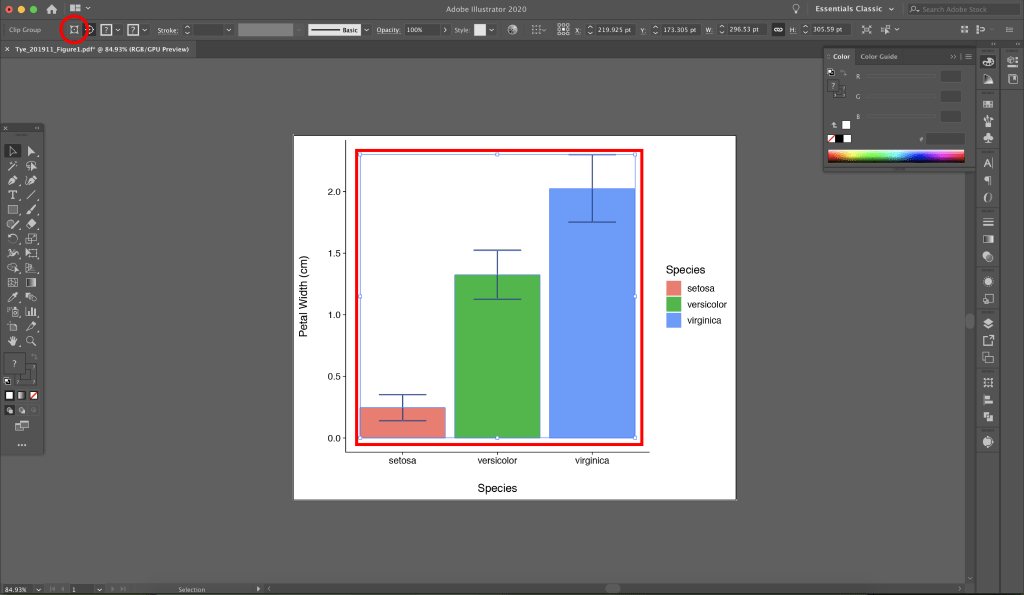
Figure 3. How to ungroup objects within the plotting area (red rectangle) of a ggplot2 figure.
Adobe Illustrator: Enhancing your ggplot2 figure
Now that you have imported your ggplot2 figure into Illustrator, removed the bounding boxes, and become acquainted with the basic tools required to move objects, the sky is truly the limit. To finish this tutorial, I will show you how to import images of the focal Iris species in this dataset and match the color of each bar to a prominent petal color of each species. First, I found images of each Iris species, that are available for educational use via a Creative Commons license, on Wikipedia (Fig. 4). After renaming the files and placing them within your working project folder, drag the files into your Illustrator workspace.
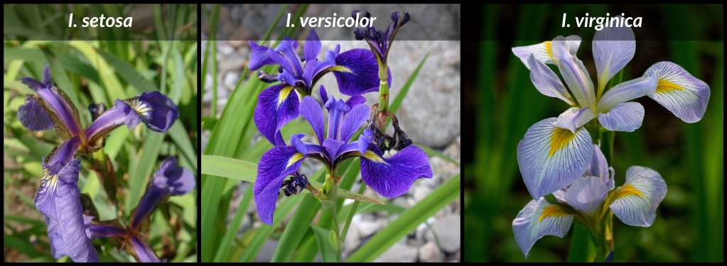
Figure 4. Images of the the focal Iris species from the built-in R dataset, iris. Image credits, from left to right, are Radomil (CC 3.0), D. Gordon E. Robertson (CC 3.0), and Eric Hunt (CC 4.0).
Adobe Illustrator: Adjusting image sizes
After importing the image files into your workspace, you will likely need to resize the images (e.g., same widths and/or heights). This may be done by clicking the Selection Tool, holding the Shift key (to ensure the image stays proportional while scaling), and dragging the image to the desired size. After you determine the size of one image, you can quickly make the remaining images the same width or height via image editting tools located at the top of the workspace (Fig. 5).
In this toolbar, there is a cropping tool, as well as definable horizontal and vertical dimensions. For this example, I clicked on a bar within the plotting area, recorded the horizontal dimension of the bar (that was displayed in the top toolbar, and made each images the same width as its respective bar. After resizing the images, I would recommend adding a small border around each image to emphasis and differentiate it from the white background.
This can be done several ways, but the most straightforward way would be to use the Rectangle Tool to create rectangles, each with a black border and no fill, that are the same size as the images. Since all of your images and rectangles need to be the same size, After creating one rectangle, you can simply copy and paste one rectangle for the other rectangles.

Figure 5. How to edit the dimensions of imported or embedded images in Adobe Illustrator CC 2020.
Adobe Illustrator: Editting the plotting area
Next, I am going to match the color of each bar in the plot to a prominent petal color of the associated Iris species. To do this, use the Selection Tool to select a particular bar (red rectangle, Fig. 6), then select the Eyedropper Tool (red circle, Fig. 6) and click on the petal of the associated species (red arrow, Fig. 6). After repeating these steps for each bar, you can go then to the Color panel, on the upper right of the workspace, and find the color hex code for each petal. To improve your original code, these hex codes may be entered into the original ggplot2 code (e.g., by adding scale_fill_manual(values = c(“#5f5da9”, “#7556a4”, “#8c8ec6”))) to automatically match the colors of your barplot and focal taxa.
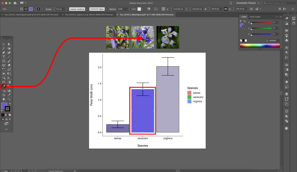
Figure 6. How to match the colors of your barplot and the petal color of the associated Iris species.
Adobe Illustrator: Exporting the enhanced figure
Once you are satisfied with the resulting figure, go to the top menu and click File / Save As. You should always save your projects as either an .ai file (Adobe Illustrator format) or a PDF with the Preserve Illustrator Editting Capabilities box checked. Like many things in your research career, this draft of your figure will likely be revisited to make additional edits. Importantly, either of these file formats can be reopened and edited in Illustrator. To save your figure for a paper or presentation, go to the top menu and click File / Export / Export As, then select the appropriate file type (e.g., .jpg, .tiff) and settings (e.g., resolution). Now that you know a little bit more about how to combine the functionality of R with the creative power of Adobe Illustrator, I encourage you to spend some extra time creating data visualizations for future papers, presentations, and outreach events. A forthcoming blog post will detail more advanced editing techniques that may be used to further enhance R figures using the Adobe Creative Cloud suite. For more information about the outlined steps or suggestions for future blog plots, feel free to email me at simontye@uark.edu.
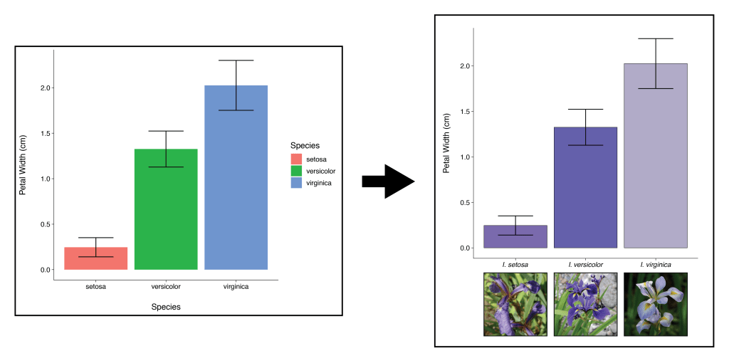
Figure 7. Comparison between original and enhanced ggplot2 figure. Image credits for insets on the enhanced image, from left to right, are Radomil (CC 3.0), D. Gordon E. Robertson (CC 3.0), and Eric Hunt (CC 4.0).
